Nothing Phone (2) Design Update Shows Glyph Interface
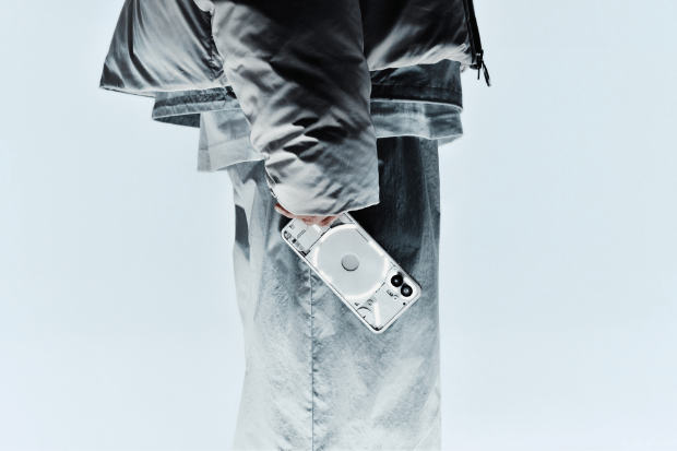
The upcoming release of the Nothing Phone (2) is scheduled for July 12, and we now have an official glimpse of the device’s back in two color options: white and grey. At first glance, the design appears largely unchanged, but there are some notable differences, particularly in the altered Glyph Interface.
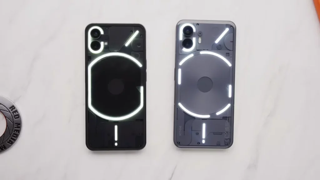
Renowned tech reviewer MKBHD provided an exclusive look at the new back design of the Nothing Phone 2. Unlike its predecessor, the top and sides of the back now curve into the frame, adding a distinctive touch to the device.
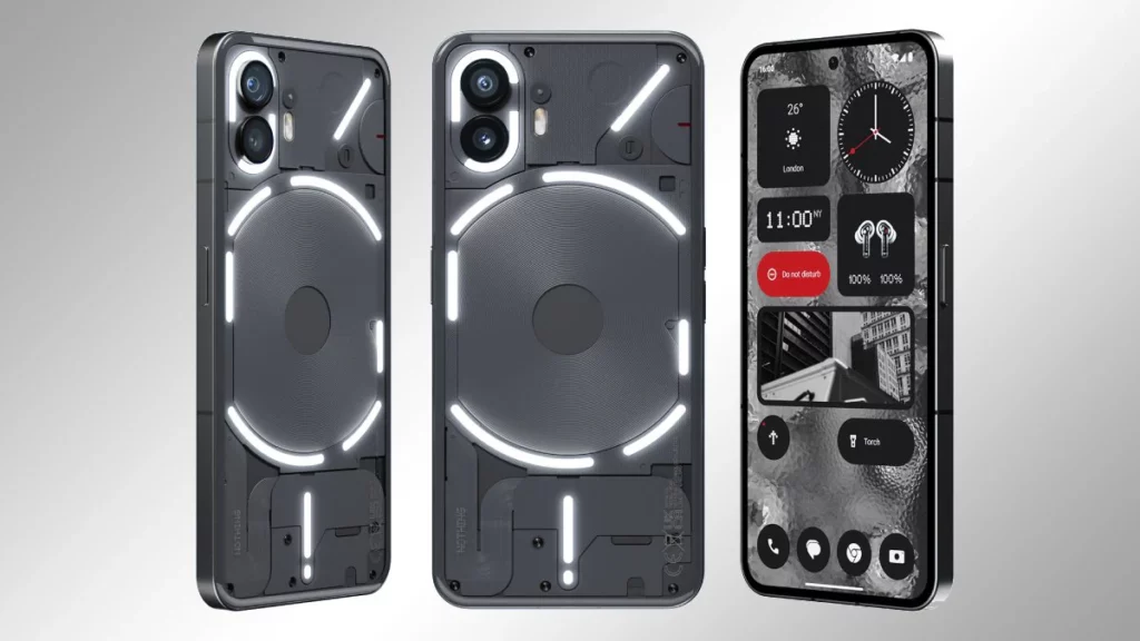
The Phone (2) boasts 11 segmented LED strips, a significant increase from the 5 units found on the original Nothing Phone (1). Additionally, the updated Glyph Interface features 33 LED lighting zones, offering users more precise control over the LEDs compared to the previous model’s 12 zones.
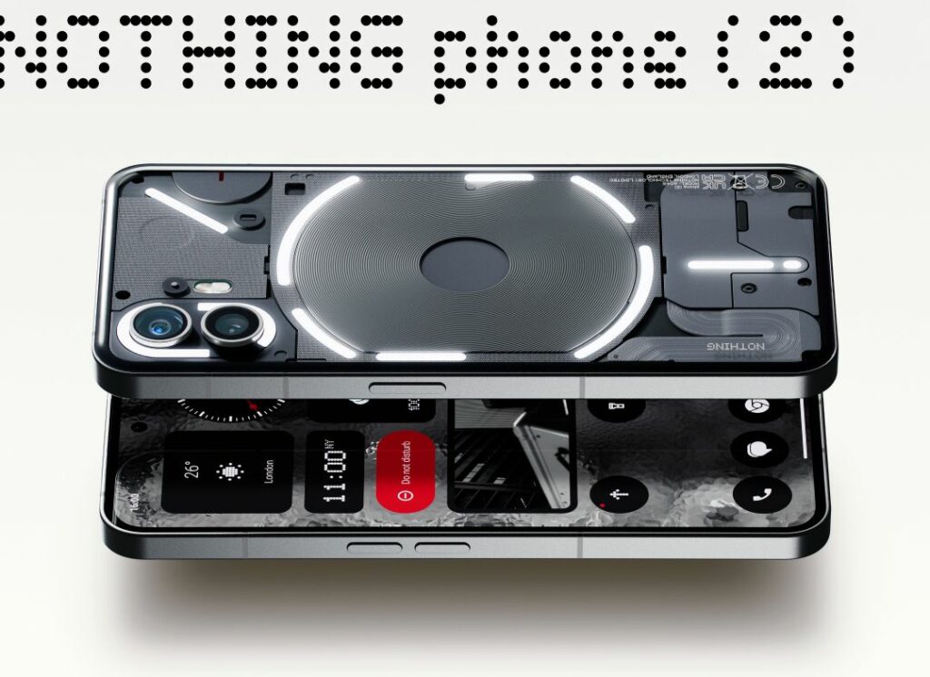
One interesting feature of the Nothing Phone (2) is the ability to control volume using the Glyph Interface on the back, which visually indicates the current volume level. The Glyph timer functions in a similar manner, displaying the remaining time within the LED strip on the back.
Nothing has also introduced Essential notifications, where a specific LED on the top right is assigned to a particular app, remaining lit until the notification is cleared. Furthermore, Nothing plans to collaborate with third-party app developers to leverage the potential of the new Glyph Interface.
Published on 07/12/23 11:35 | by Rawa John

